
Content Marketing for Founders: Repeat Chapter One
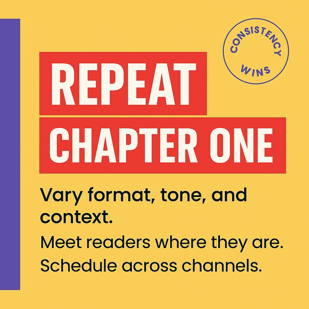
Escape the Founder Projection Trap: Speak Chapter One to Readers on Page One You think they already heard it. They have not. Most of your future buyers are quiet, watching, deciding. They are not bored by seeing your core idea again. They need to see it again. "Repetition does not bore people. Repetition teaches people." […]
Daily Compounding: Turn One Post Into 40 Wins for Founders
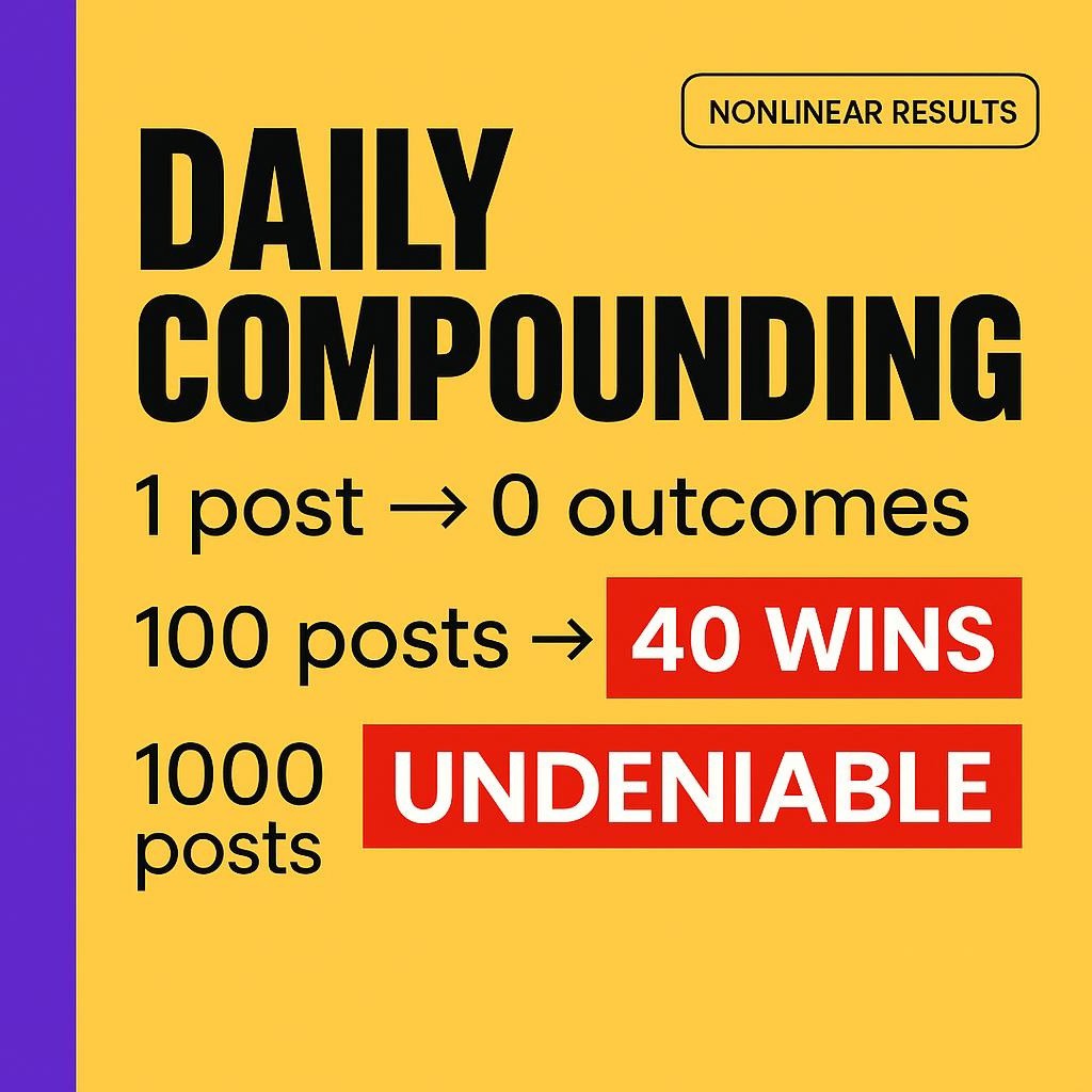
Daily Compounding: How One More Post Today Multiplies Into 40 Wins Later Your next post is not a post, it’s a brick in a system that keeps working when you log off. You’ve felt the worst version of this. You fight for an hour of focus. You write something real. You hit publish. Then… nothing. […]
Content Rituals: Build Belonging and Scale Trust Daily

Build the Heartbeat Your Audience Can Feel: Rituals That Scale Belonging You don’t need louder. You need steadier. “Posting daily with recognizable cadence, tone, and thematic throughlines is ritual.” Ritual turns scattered posts into a heartbeat people can feel, which is why they keep coming back, even if they can’t explain why . The Quiet […]
Content Marketing: Warm the Room, Stop Posting to Nobody

The Warmed Room: Why Content Fails in a Vacuum (and How to Heat It Fast) Great posts die in empty rooms. Not because your ideas are weak, but because the room was never warmed. Platforms introduce warm brands to new people, not cold stages begging for applause . Why Strong Content Still Gets Ignored Most […]
Founder Content to Market Memory: Build Daily Trust

From Founder’s Head to Market Memory: Extracting the Wisdom You’re Sitting On Your mind is already a content library. Frameworks. Scars. Contrarian truths. The problem is not ideas. It is translation and repetition, the kind that turns lived experience into a voice people recognize, then remember. Inkflare exists to translate the truth inside you, at […]
Repetition That Teaches: Repeat Yourself, Build Trust
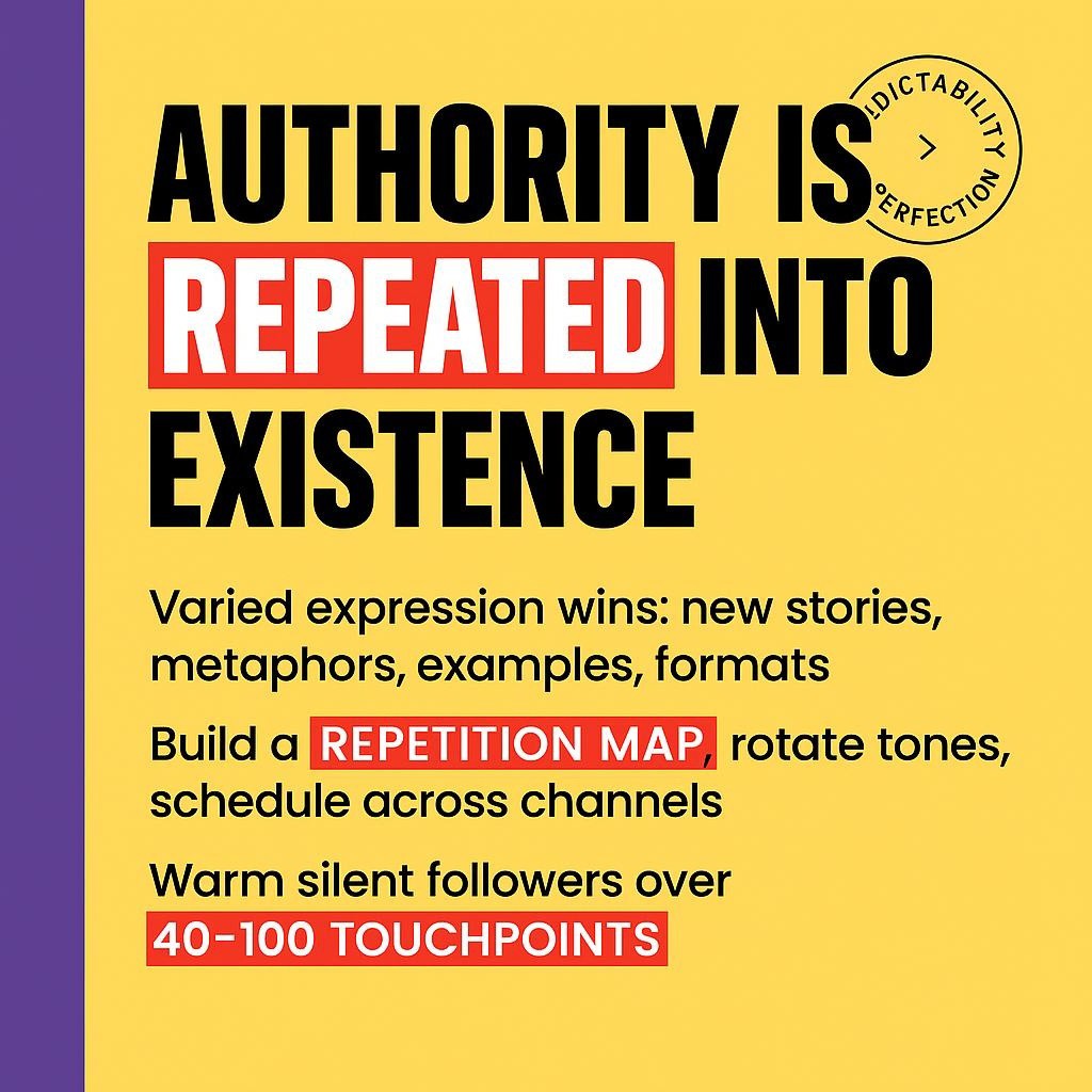
Repetition That Teaches: How to Repeat Yourself Without Sounding Repetitive Authority is not a headline, it is a drumbeat. You do not become a reference by saying something once. You become a reference when people can finish your sentences. Or as we like to say, "Authority isn’t declared — it’s repeated into existence." The Hidden […]
Marketing Gravity: Build Magnetic Demand Without Burnout
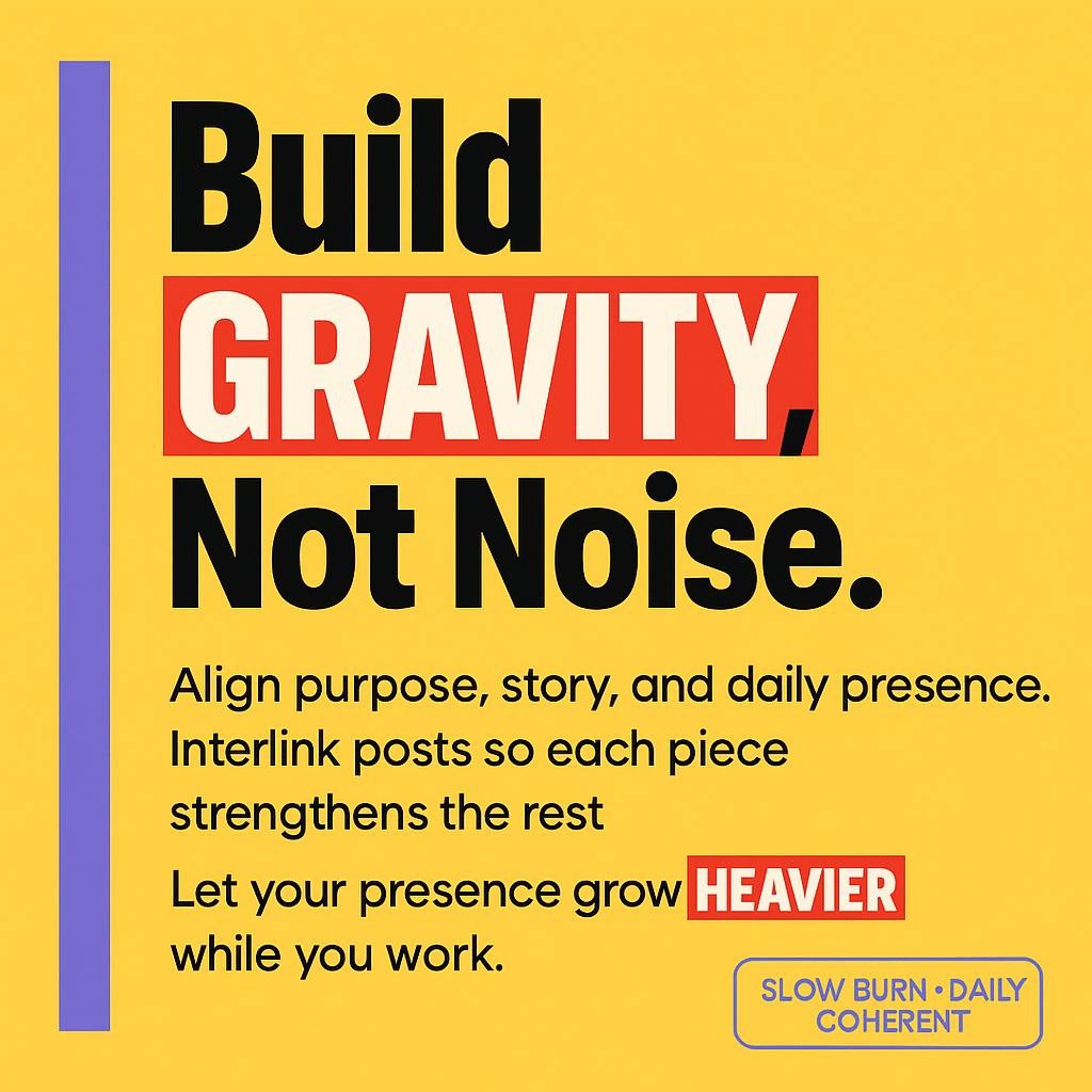
Marketing Gravity: Build a Brand People Orbit, Without Chasing You do not need louder tactics, you need heavier presence. When your purpose, story, and daily rhythm line up with clarity and consistency, people drift into your world on their own. That pull is marketing gravity. It is built, not bought. What Gravity Really Is Most […]
Become a Guide, Not a Guru: Win Trust That Compounds
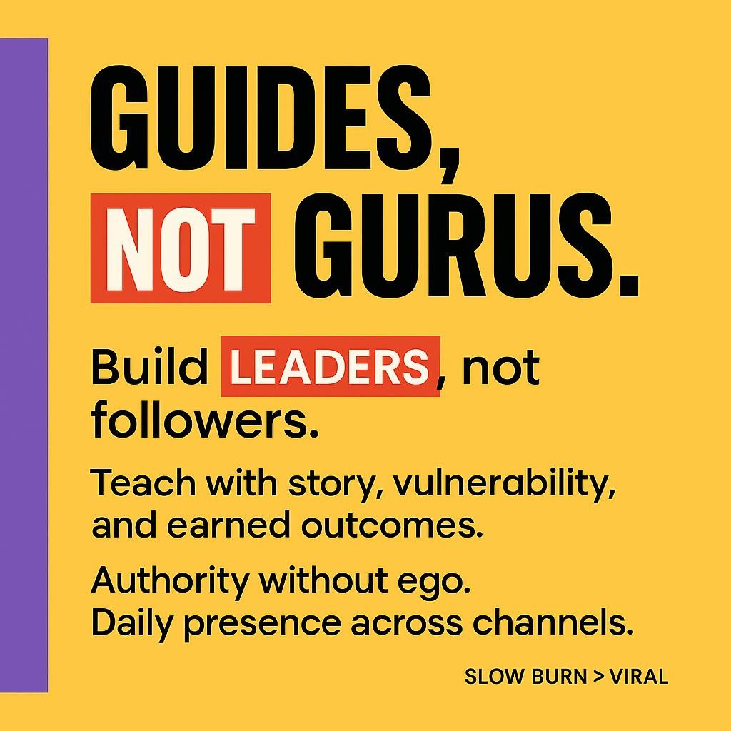
Become a Guide, Not a Guru: Authority Without Ego in the Age of AI “Gurus want followers. Guides create leaders.” That shift is the quiet revolution your brand needs, and it changes how people trust you, learn from you, and stay with you over time . The Moment Authority Flips From Ego To Service A […]
Marketing Gravity: Pull Customers Daily, Without Burnout
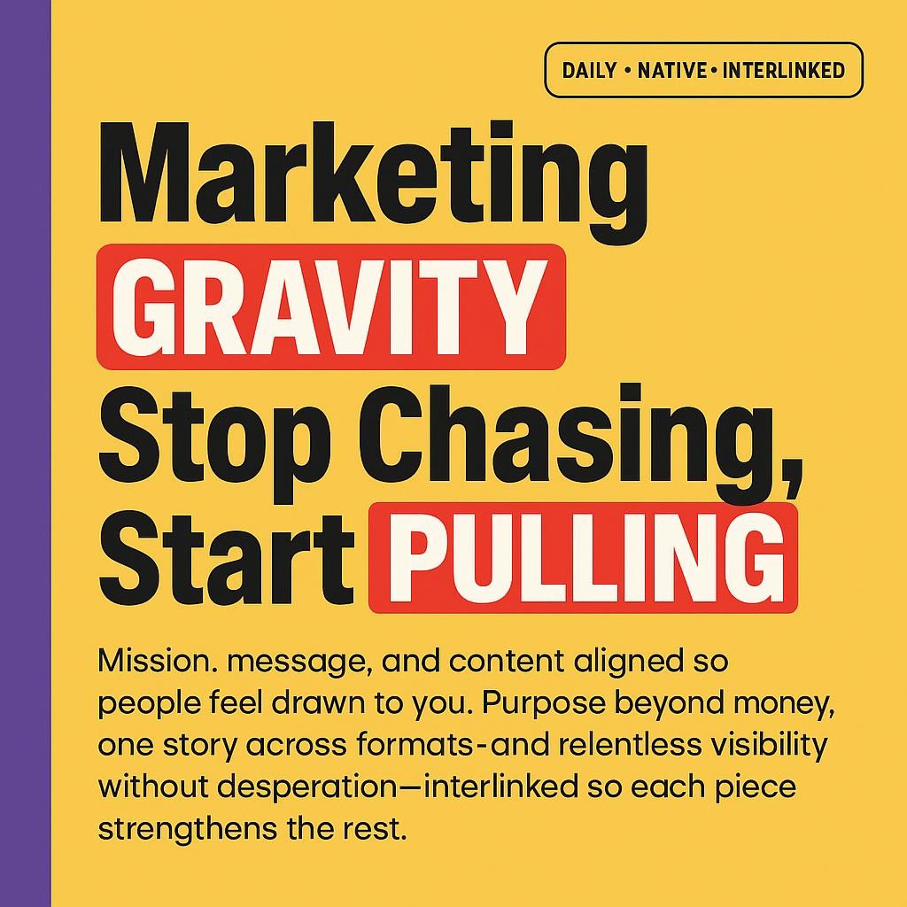
Marketing Gravity: Stop Chasing, Start Pulling Bold truth: the brands that feel magnetic are not louder, they are more aligned. When your mission, your message, and your content point in the same direction, people do not need to be pushed. They feel pulled. “Marketing gravity is what happens when your mission, your message, and your […]
Marketing Thermostat: Keep Your Brand Warm Daily, Effortless

The Marketing Thermostat: How to Keep Your Brand’s Heat On, Automatically If you do not set the temperature, your brand will cool. Not because you lack passion, but because life happens. A client crisis, a product sprint, a sick day, then silence. The audience is not angry, just unsure. Warmth fades into doubt. The fix […]